Evidence
Evidence is defined in the dictionary as "the available body of facts or information indicating whether a belief or proposition is true or valid. Photography throughout the years has been a very valuable source of evidence, due to it helping to capture moments in time and showing factual evidence of things that have happened. However, it isn't always clear what has occurred or happened in a photograph ( sometimes due to composition or lighting but it can also be due to the lack of information provided).
'Evidence': one of the most significant photobook createdThe photobook 'Evidence' was created by artists Larry Sultan and Mike Mandel in 1977. The two artists created the book by combining a collection of photographs that were found in the archives of American industrial organisations ( the photos had previously been used to document tests and technological experiments ) and put them in an order with any information or insight into what was happening in or the purpose of the photographs.
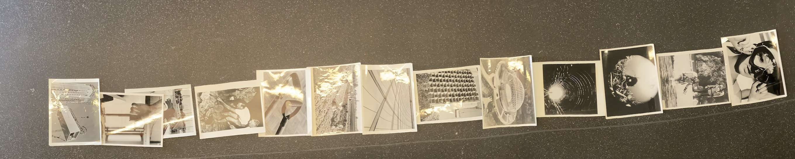
Here are some photos from the book: |
|


Experimenting : photograph of a photograph
We were given a photograph from a scientific/industrial archive, purchased by our teacher on eBay, and instructed to:
1) Photograph the photograph so that light is reflected on its surface, partly obscuring the subject
2) Photograph the photograph with someone else’s hand (holding, pointing, obscuring etc.)
3) Photograph the photograph in an unusual place
4) Photograph the photograph inside a book. Consider the relationship between the photograph and the adjacent text/image(s)
5) Photocopy the photograph. You may do this in any way you like.
6) Disrupt/obscure (don’t damage) the photograph in some way. Photograph the disrupted/obscured photograph
Experiment #1:


Experiment #2:


I found through these two experimentations that retaking photos of physical photos can be really interesting and can add new elements to the original images. I found that my most successful images were the ones where I contrasted the black and white images with bright colours as well as placing a new reflection of light onto places in the image where the images
Beyond Evidence
I have include this video as it discusses the exhibition where the photos in the Evidence photo book were shown as well as photographers who have create similar or inspired photographs from the book Evidence.
Bullet points from the video:
- In the 2015 exhibition the work was presented in a way that created a rich vein of storytelling
- The term evidence in the exhibition title implies a concern with truthfulness
- It created a whole new culture of working with photography and creating new narratives by decontextualising images from taken from archives
- The artists went to over 100 places and went through 2 million images to get it down to the 59 images that ended up being in the book
- Creating a sequence of double-page spreads enabled them to express what Mandel has called the poetic narrative
- Instead of transforming found images into their own work the worker magazine cooperative attempted to make open-ended narratives in collaboration with domestic workers who shoot their own photographs
- In Sara-Lena Maierhofer's work she explored the life of a con man, Christian Karl Gerhardt, and she showed this through photography as she believed that photography is a shiny surface that makes us believe in things just as a conman makes you believe in things you kind of desire
- Sarah pickering took an approach that is similar to the Mandel and Sultan book in that it juxtaposes works by Greenhalgh by original works by Joseph wright and works in the style of Joseph wright and they sit alongside police evidence tv props and press clippings to examine how the story of a forger becomes recreated by the actors involved
- The curator of the curatorial vision is to play with what we consider the truth and we are becoming aware of the limit of the didactic and the limit of the singular narrative but the show explores multiple narratives as well as painting a more true picture of the world
- Mike Mandel describes the structure of the book evidence and states that "there's a sequence and the photographs are in the place where they're supposed to be and there's kind of a climactic moment and then there's a kind of chaotic denouement and then it kind of just sort of dissipates into entropy"
A story in photos:
Becoming
I took inspiration from my previous ' photograph of a photograph' experimentation and wanted to add my own story to it. I wanted to show the story of me becoming who I am today but I wanted to show this through polaroids as I feel they were a successful way to demonstrate the different moments in time. I also wanted to test out two different versions of these photographs to see the different effects of the images being together and slowing revealing each stage of my story or just the images on their own but still changing. In the first set of photos the amount of polaroids decreases by one each time which can demonstrate the way time is changing with each polaroid. However, the second set is just the polaroid on its own showing how each polaroid is its own single moment with its own importance.


Ordering photos
In a group we had a series of photographs that we needed to put in an order that we felt created meaning and gave a successful flow and connections to the images. Each of us put in our own thoughts into how we felt the photos should be ordered and we all managed to include each of out ideas into the order of the photographs. In the end there was a mixture of narrative links between the images and abstract, and shape connections between the images.


The Grey Area
"While the notion of a document is historically tied to ideas of certitude and confirmation and is primarily used in the legal realm, this certitude has all but vanished from contemporary consciousness. The experiences of the 20th century, its large-scale enterprises of propaganda and disinformation, have created an attitude, which could be called habitual distrust as well as advanced media literacy. Documentary modes still appeal to institutional modes of power/knowledge and cite their authority, but the effect is rather a perpetual doubt; a blurred and agitated documentary uncertainty..."
-- Maria Lind and Hito Steyerl, ‘The Greenroom: Reconsidering the documentary and contemporary art’.
We have become less trustful of photographs at this point in history due to wide spread accessibility to editing software and the repetitive use of it in the media. Documentary photographers will find peoples lack of reliability in photography challenging due to the fact that people may not believe what they have taken when the photographer has gone to large lengths to create a genuine photographs. However the photographer could find a way to use this distrust to their advantage.
The 'grey area' between fact and fiction could be an interesting space for photographers to explore as they could try to deform and manipulate the observers view on what is real and what is fake. 'Documentary uncertainty' means that something that has been documented but there is unreliability about how real the photograph is and if it has been either staged or manipulated.
Response to these ideas (at school)


When taking these photos I was trying to think abstractly about what I was taking photos of. So I ended up taking images of the areas between things, such as the area between structure but also the area and relationship between people. When taking the images of people I wanted to take the photo not the whole person but just their lower half of their body to emphasizes the area between the people.
Abandoned
(the grey area)
|
When given the task of taking photos of 'the grey area', it took me a while to come up with an idea for this abstract task but I had the idea to take photos of a place that doesn't have any use and simply is suck in the grey area. Near my house, there is an abandoned building that has had many uses as well as there have been many people how have tried to turn it into something else ( such as a cinema ) but it has to fall through every time and therefore the building is stuck in the grey area of neither having a purpose or being knocked down.
I thought this would be a really interesting place to take photographs of for this project due to the reasons above as well as the beauty and interesting shapes of the building. Also in these photographs I was able to capture the way the building has been affected by being in the grey area. You can see all the cracks, vandalism and lack of love that the building has seen due to no longer having a purpose.I wasn't able to go inside the building due to it being locked up, however there is a video about the building ( which you can see to the side ), which shows the inside of the building too and I think the inside emphasises it lack of use and love. |
|


Jack Latham
A Parliament of Owls


|
This photo book is based in California about the conspiracy theory about how the presidents and other important people meet and discuss issues, the group was called Bohemian Grove. The book contains images from CCTV cameras and photos Latham has taken himself of the surrounding area and images he took seeking into Bohemian Grove. The bottom of the page edges are deliberately uncut so you have to peek behind the main page to see, such as conversations between the members in the Bohemian Grove.
I have included a video that describes what the Bohemian Grove is like and the goings on that occur. |
|
Analysis of one of the photographs from ' A Parliament of Owls'

Sugar Paper Theories


Notes on video:
|
|
Image analysis
|
|
I took one of Jack Latham's photographs from this project and added grids and shapes to analysis how Latham positioned the photograph. As you can see the photograph is very symmetrical and Latham has intentionally lined up the centre of the church with the centre vertical and horizontal lines of the frame which is very dramatic as it demonstrates how this is the main focus of the photograph. This is further emphasised by the lines in yellow as the middle third of the frame encases the church inside, we can also see this with the red triangle. Overall this photograph has been taken in such a beautiful way due to the lighting, positioning and soft tones.
|
Clocks for Seeing
There is in fact no such thing as an instantaneous photograph. All photographs are time exposures of shorter or longer duration, and each describes a discrete parcel of time. This time is always the present. Uniquely in the history of pictures, a photograph describes only that period of time in which it was made. Photography alludes to the past and the future only in so far as they exist in the present, the past through its surviving relics, the future through prophecy visible in the present.
-- Jon Szarkowski, The Photographer's Eye
For me the noise of Time is not sad: I love bells, clocks, watches — and I recall that at first photographic implements were related to techniques of cabinetmaking and the machinery of precision: cameras, in short, were clocks for seeing.
-- Roland Barthes, Camera Lucida: Reflections on Photography
Make a sequence of photographs documenting what life is like in school. Think carefully about:
- the types (genres) of image you make e.g. portraits, landscapes, still lives etc.
- the particular subjects you choose i.e. who and what you select as subjects (and why)
- the way you compose your pictures i.e. portrait or landscape format, use of focus, rule of thirds etc.


Edited and sequenced images
In these photographs I wanted to covey my view of school and school life as someone who is new. This is present in the slanted, off centred photograph of me walking in the corridor as I wanted to convey how I have a different view from others in my year who had gone to the secondary school here. I also wanted to show the feeling of being an outsider and someone who is in a new environment in the photos of me standing outside with people walking quickly past me. These didn't come out as well as I wanted as the light was so bright and therefore couldn't create a more successful blur of people walking past. However when I edited the photos graphs when I made the really bright photos dark they revealed some interesting movements that contrast the bright lights and I ended up quite liking these. I also wanted to demonstrate the things I see everyday ( such as the block one building as this is the only building I have lessons in) as well as I wanted to take an image of my dyslexia overlay glasses as they are something that I use everyday at school to read things and I think I did this successfully with my photo of the writing in focus in the yellow frame of the glasses ( the photo even though it was my first idea, came to be one of my favourite photos).


Research:

|
Julian Germain
Julian Germain met Charles Snelling in 1992. A couple years after Charles' wife had died. Germain said that it was the colourfulness of Charles car, house, plants and flowers in the front window that were “the reason I knocked on his door and we met.” This was the start of their friendship that created an 8 year long photographic documentation of Charles’s life, which ended in 2005 with the photo book of ‘For every minute you are angry you lose sixty seconds of happiness’, five years after Charles had died. The title of the photo book came from a saying Charles used to say. I really liked his use of capturing the bright colours and the way the he captures simple details of Charles life but in such a beautiful way. I also like how the photos/compositions seem so natural and effortless and almost incidental but it truly captures Charles life without any filters or a false display.
|


John GotoIn 1977 Lewisham Youth Centre, John Goto made a series of photographic portraits of young British African Caribbeans. It wasn't until 2013 that circumstances allowed him to first exhibit and publish the work in his book 'Lovers Rock'. He had told people that he would have the Youth Centre open (where he had photography classes) and people could come in and he would take their photos. What made me want to include this project in the Clock for Seeing project is the way these photos capture these people in a moment in time and have the focus and the beauty of what people in everyday life just look like, with no props or being told to wear anything, they are just themselves and what they looked like in that moment. I also really like beauty of these photos as I like how it is presenting black people in this beautiful way, which juxtaposes some peoples attitudes in the 1970s. And I feel like that is really impactful.
|

|


|
|
Helen LevittHelen Levitt is a street photographer, who spent decades taking photos of everyday life in her local community of New York. She took both black and white photographs as well as colour ( but I personally like the coloured photos and I like how they each have a prominent colour that contrasts the dreys and mundane colours of a street). In her life she also used other mediums from photographs to artist books and filmmaking. Her work went early from photographs of chalk drawings, to portraits of New York subway passengers and vivid colour photography.
I have include a video of one of her exhibitions which i got some of my information from. |


Initial shoot
In these photos, I explored the type of photography I enjoy taking, portraits. I intended to take photos of the beauty of colours in people and in nature and how they work together. I explored this by taking portraits of my friend who has the most beautiful red hair, I wanted to use this colour and take photos with the beautiful autumnal colours. I feel like these came out really successfully as the colours just really work well together (seen in one of the photos where it seems like her hair is blending into the leaves) but also how some of the colours beautifully juxtapose each other (such as the green and the orange). I also tried to take photos of the leaves falling around her but I feel like these didn't work as well as the others as the wind blew them in the wrong way so i would like to attempt to capture the movement more successfully if I was going to do this again. I also tried out different compositions ( such as how far I was away from her) and I feel like the closer compositions were better as you can see and capture both the surroundings and her face. I also like how the wind help create successful photos.


My Favourites
Environmental Portraits
Niall McDiarmid is a street photographer who is interested in the colours of peoples clothes that he passes on the street and how these colours work and juxtapose the environment around them. He travels to a large amount of places in England to try and show the people to who live or are just walking by.
Responce at school


Environmental Portraits
Shot on a Fuji GS645S medium format camera with Ilford HP5 400 ISO black and white film.
Scans


Photoshop Edits
|
|
I got to take one photo on the Fuji GS645S medium format camera and I feel like the photo is okay but could be improved. I feel like even though the photo is in focus I feel like the subject could be more centred. I also think there is too much space above the head so I feel like next time I will try a close composition as well as a a more centred image. I also think I would try a different background as I feel the colour of his coat sort of blends in with the surroundings and I want to subject to stand out.

|


A Second Shoot Of My Initial Ideas
In these photos, I wanted to further explore the beauty of colours but now looking at the colours found where I live how they work together with people and other things. I explored this by walking around Catford, where I live, and taking photos of colours I spotted around and how they work with their surroundings. I feel like these came out really successfully as the colours just really work well together (seen in the photo of the man in a red coat blue bag and yellow hat which correlate with the colours around him ) but also how some of the colours beautifully juxtapose each other (such as the green and the purple, blue and orange and red and yellow ).


Further exploration with film camera's
Environmental Portraits (Fuji GS645S (Part 2))
These images where taken on a Ilford XP2 Super 400 ISO 35mm film as well as ISO 120 film. What I enjoyed about this task was learning how to use the film cameras and how the different settings slightly and largely affect the images. I feel like this time round my images improved (especially the first two as I really like how I have successfully created the focus and how the background is blurry and the subjects are clear) but also I like the grain of some of the other images as I still feel like it creates its interesting effect and I don't think it makes the image less affective.
My images:


Whole class images:


Making a zine
|
For my first attempt at making my clocks for seeing zine, I used a template for a quarter-fold zine that if folded out would make a poster. I opened this template up in InDesign and added my images in the places I felt would be the most successful. I chose one of my favourite images to be on the poster as I feel that this image is really impactful in a larger scale as the way the colours pop and juxtapose each other is really successful ( as well as the way the branches mirror the movement of the wave graffiti). After I was happy with where I had put these images in the template I then printed it out double sided on to an A3 pieces of paper to allow it to make an A3 poster but a A5 sized zine. I then trimmed the zine and folded it together. Overall I felt that i was really happy with how the zine came out and I really liked how I put the photos together (link colours).
|
|


